The uranium sector has been making headlines recently. The following 5 charts should help you get the big picture in under 5 minutes.
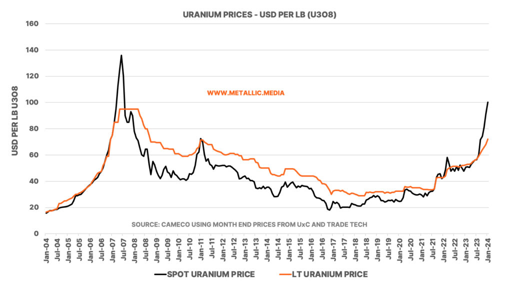
The graph below shows the uranium spot and contract prices (LT = Long Term) for uranium over the last 20 years. Spot prices haven’t reached these levels since 2007, and contracts prices appear to following the spot market higher. Spot prices as at 31 January 2024 traded at US$100.25 per lb (U3O8 – Uranium Oxide) and long-term contract prices traded at US$72.0 per lb.
For those not familiar with the market, most uranium is traded through longer term contracts. According to the World Nuclear Association ‘Most trade is via 3-15 year term contracts with producers selling directly to utilities at a higher price than the spot market, reflecting the security of supply. The specified price in these contracts is, however, often related to the spot price at the time of delivery.’
According to the EIA, ‘Spot contracts are contracts with a one-time uranium delivery (usually) for the entire contract, and the delivery typically occurs within one year of contract execution (signed date). During 2022, 15% of the uranium delivered was purchased under spot contracts.’
As the following table from the World Nuclear Association, Kazakhstan dominates global production of uranium accounting for 43% of world mine production, with Canada second at 15% and Namibia third at 11%.
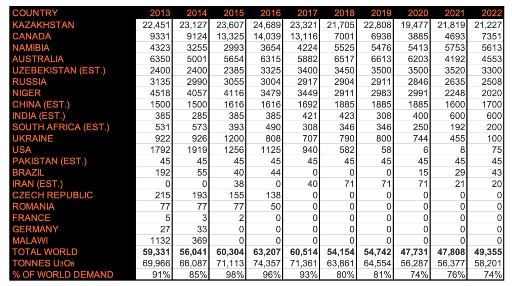
The chart above shows world mine production of uranium. To convert uranium to uranium oxide (U3O8) remember to multiply by 1.17924.
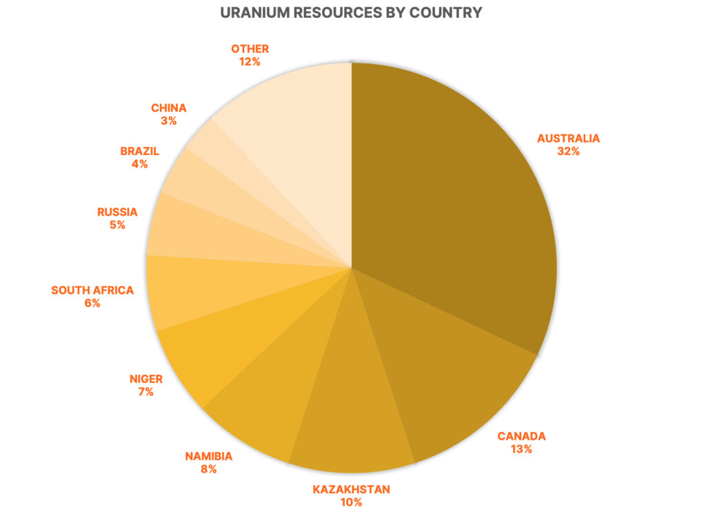
Australia accounted for 9% of world mine production of uranium but its resources make it a world leader.
The following pie chart shows the known uranium resources by country. Australia dominates by some distance.
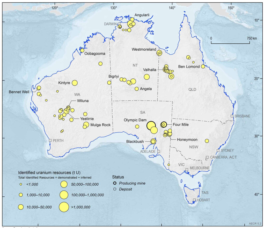
Geoscience Australia publishes these brilliant maps for various metals. Here’s their latest uranium map, showing major uranium deposits. There are currently two operating uranium mines in Australia: Olympic Dam and Four Mile. Both located in South Australia. The giant Olympic Dam mine, owned by BHP, is an underground mine that produces uranium as a by-product. It’s production accounted for 6% of global mine supply in 2022.
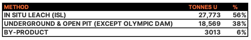
Mining methods have been changed significantly over the years. In 1990, approximately 55% of world production came from underground mines, but this decreased 33% by 1999. In the 2000’s, new production from underground Canadian mines increased it again, but by 2022 In Situ Leach (ISL), also called In Situ Recovery (ISR) mining accounted for over 55% of production:
This was just a whistle stop tour of uranium. There’s far more to delve into but outside of Kazakhstan’s dominance in mine production, others, notably Australia and Canada, are set to benefit from the recent resurgence in uranium prices.